Animated Metro style control in WPF
Here is a little set of control that allow you to create (quickly) a Metro like menu.
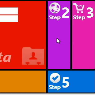
Example :
[jwplayer config= »GrundgeAdapt » file= »http://www.alphablog.org/TiercePartie/Video/GridControl.mp4″]
Bring me now to download !
Way it works :
The project is done by two distinct items.
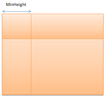
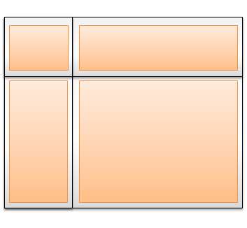
First one is a behavior that you put on a grid, the SliderGridBehavior. It will transform the given grid to a « moving » grid. When you click on one of it’s cell, you will expand it (with an animation). You can configure :
- MinHeightWidth : The min height/width that represent the collapsed mode of a cell.
- DurationOfAnimation : Duration of the transition in seconds (default is one second, like in the video).
- EasingFunction : Function used by the animation during the transition.
- ManageSmallOrNormalTemplate : If activated, the behavior will manage the state of the next control (see below).
The grid will detect a click and expand/collapse rows and columns with the given animation.
The second control is the MultiContentControl. You may define :
- Content : The content of your control (your ViewModel for example)
- ContentSmallTemplate : Your template that will be used in the « Collapsed » version.
- ContentNormalTemplate : Your template that will be used in the « Expanded » version.
- IsSmallTemplate : Your attribute you can get or set for determining the current state. Setting it atruntime will start the transition animation.
- DurationAnimation : Duration of the transition in seconds (default is one second, like in the video).
- EeasingFunction :Function used by the animation during the transition.
This Control will add two templates of the same content : one with the « small template » and one with the « expanded template » and will manage opacity and hit test with transitions.
You may orchestrate them !
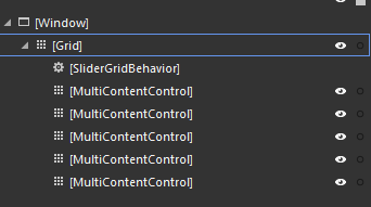
This is the object treeview of the test project (demonstrated in the video). You can see that i have a main grid with my behavior and i have one MultiContentControl per pane in the view. I also set the « ManageSmallOrNormalTemplate » property to True in the behavior so when the user click on a grid cell, the behavior will expand the cell first and will search for a possible MultiContentControl in this cell and change the IsSmallTemplate property to true. It also set all MultiContentControl’s IsSmallTemplate property to false.
Blend, of course
The Behavior and the control is 100% complient with Blend. You can change the IsSmallTemplate in Blend and see the transition. You can also edit templates and easingfunction with Blend powerful editor.
Known bugs
I was not able to open the xaml of the test project in VS 2012. I dont mind, i use Blend 🙂 I had Blend library : System.Windows.Interactivity.dll & Microsoft.Expression.Interactions.dll for who do not have it (what a shame…)
Edit : You must add a row in your grid (at least).
Download
You can download the project here : http://www.alphablog.org/wp-content/plugins/download-monitor/download.php?id=SliderGrid.zip
You must set the test project « as Startup » and click on run.
One thought on “Animated Metro style control in WPF”
Hello! You can also use Elysium (elysiumproject.net) as theme.